Vivid Leafy Autumn Logo
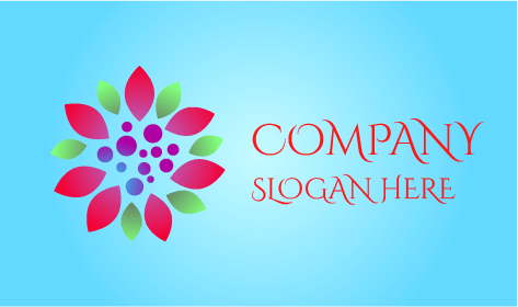
We present our vivid leafy autumn logo, a good blend of unity and courage. The emblem features contrasting leaves in a moving circle against a contrasting background letting your business shine brightly. The bold pink color symbolizes love, nurture, and warmth whereas the green color symbolizes freshness, fertility, and harmony. At its center, the small and big dots are the main medium of attraction to give your fall season better visibility.

