D R A W L O G O
Logo Design Andrew Paker

10 Mind-Blowing Logo Design Tips That Will Transform Your Creative Process

10 Game-Changing Logo Design Techniques — Will Patterson

Logo Design Secrets — Will Patterson

Over a decade of brand identity experience

Creating memorable, professional logos requires more than artistic talent — master visual perception, composition, and process.

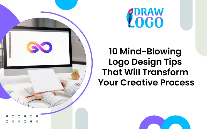
Transform your approach with ten game-changing logo design techniques

Whether you're a beginner or seasoned creative, these techniques — from visual illusions to advanced kerning — will elevate your logos from good to exceptional.

Quick overview

  • 1 Visual perception & optical fixes
  • 2 Creative ideation methods
  • 3 Typography, spacing & testing
  • 4 Process, originality checks & skill growth

Understanding Visual Perception in Logo Design

The White Object Illusion: Why Your Eyes Are Deceiving You

White objects on dark backgrounds often appear larger than identical black objects on white backgrounds. This optical effect can upset perceived size consistency across brand applications.

Why This Matters for Logo Design:
  • Your logo appears differently sized depending on background color.
  • Brand consistency suffers when logos look unbalanced across applications.
  • Professional designers must account for this perceptual difference.
How to Counter It
  1. Add internal strokes to your logo design.
  2. Expand the stroke inward with your shape tools.
  3. Create a slightly smaller cut-out version for light backgrounds.
  4. Test both versions side-by-side for consistency.

The Boning Effect: Creating Natural-Looking Curved Elements

When circular elements meet straight lines poorly, the join looks like a bent bone — which reads amateur, especially at small sizes.

Solution Process
  • Split the curved shape into quarters.
  • Add an anchor point at the connection.
  • Pull the anchor point for a gentler transition and adjust curve gradients.
  • Copy and refine until flow is smooth at all sizes.

This minor adjustment converts amateur joins into natural, professional shapes that read clearly on business cards, screens and signage.

Creative Ideation Techniques

The Noun Method: Building Memorable Brand Concepts

Start from concrete nouns (objects/visuals) rather than abstract ideas. This produces instantly communicative logos.

Step-by-Step Process
  1. Extract Core Nouns: Analyze name & mission; list 5–10 physical nouns.
  2. Simplify Forms: Draw each noun at its most basic shape.
  3. Creative Combination: Overlap or merge two strongest nouns.
  4. Refine & Test: Test readability and clarity at multiple sizes.

Example: For "Bone and Bread" cafe — primary nouns: bone, bread, coffee, tea, mascot. Combine & simplify for a memorable mark.

Mind Mapping: Thinking Outside the Creative Box

Use mind maps to visualize connections between concepts, words and visual elements and generate nuanced directions.

Tools & Process
  • Tools: MindMeister, XMind, or pen & paper.
  • Color-code categories: services, values, visuals.
  • Cross-link unrelated items to spark fresh ideas.

Mind maps are powerful presentation material — they show strategy, justify choices, and build client trust.

Typography and Spacing Mastery

Creating Perfect Clear Space Around Your Logo

Clear space ensures a logo breathes and reads across contexts. Use a shape-based method to create proportional padding.

Shape-Based Clear Space Method
  1. Identify a key measurement (x-height for logotypes, main shape height for icons).
  2. Duplicate the unit around the logo to set boundaries.
  3. Convert that boundary to an artboard so exports keep consistent padding.

Mastering Logotype Kerning and Tracking

Logotypes usually require tighter kerning than body text to act as a single visual unit.

Professional Logotype Kerning Process
  1. Start with Optical kerning in your software.
  2. Manually adjust unbalanced letter pairs.
  3. Tighten overall tracking for cohesion.
  4. Test at multiple sizes and print to confirm.

Advanced Design Psychology

Why Perfect Shapes Look Imperfect

Perfect geometry can look unnatural. Slight, careful adjustments make shapes feel visually 'right' to human perception.

How to Create Naturally Perfect Shapes
  • Start with geometric primitives (circle, square, triangle).
  • Make subtle anchor-point adjustments — test at different scales.
  • Compare the adjusted shape to the perfect version to confirm improvement.

The Mirror Test: Catching Typography Mistakes

Flip your logotype horizontally to stop reading it and instead analyze shapes and spacing — a quick and revealing proofing technique.

  • Reflect text horizontally in your editor.
  • Print the reflected version and look for spacing and weight issues.
  • Note problems and iterate until consistent.

Practical Validation and Quality Control

Avoiding Accidental Logo Plagiarism

Use reverse image search (Google Images) early and often to verify originality before presenting to clients.

Reverse Image Search Checklist
  • Export logo high-res and run Google reverse image search.
  • Check black & white, simplified icons and rotated variants separately.
  • Save screenshots of results as due-diligence proof.
  • If conflicts appear, assess audience overlap and adjust design.

The 20 Quick Drawings Method: Breaking Creative Blocks

Set a 20-minute timer and sketch 20 one-minute ideas — no erasing, no judgment. This volume-based method produces unexpected winners.

  1. Set up: paper, pen, timer — no erasers.
  2. One minute per idea; embrace mistakes.
  3. Review later: circle 3–5 promising directions to digitize.

Advanced Professional Techniques

Logo Verification Through an Experimentation Mindset

Treat concepts as experiments — failing fast teaches more than endless refining of one idea.

Practical Framework
  • Generate multiple directions internally.
  • Test extreme variations and unexpected combinations.
  • Document results and reuse failed experiments as inputs.

Professional Learning & Skill Development

Specialize in areas like custom lettering and brand strategy to command higher fees and resist commoditization from automated tools.

  • Custom lettering & type design
  • Brand strategy integration
  • Advanced software workflows
  • Client presentation & storytelling
  • Industry-specific design requirements
  • Continuous education & portfolio refinement

Key Takeaways for Professional Logo Design

Essential Visual Techniques
  • Counter the white object illusion with internal strokes.
  • Fix the boning effect for natural transitions.
  • Use slightly imperfect shapes for human appeal.
  • Apply the mirror test to catch hidden typographic issues.
Strategic Creative Methods
  • Use the noun method for memorable concepts.
  • Mind map to justify design decisions.
  • 20 quick drawings to beat perfectionism.
  • Adopt an experimentation mindset.
Quality Control
  • Create proportional clear space.
  • Master logotype kerning & tracking.
  • Verify originality with reverse image search.
  • Document your process for client confidence.
Professional Development
  • Specialize in bespoke skills to command higher fees.
  • Understand design psychology to connect with people.
  • Invest in continuous learning to stay competitive.

Conclusion: Elevate your logo design practice

Combine artistic intuition with scientific understanding. Start by applying one technique from this guide to your next project — your future clients will thank you.

Hire Designer