D R A W L O G O
The Evolution And Meaning Behind The McDonald’s Logo
Logo Design Andrew Paker

The Evolution And Meaning Behind The McDonald’s Logo

McDonald's Logo Analysis — Design Psychology

McDonald's Logo Analysis — Design Psychology

The power of the Golden Arches

How a simple "M" became the world's most recognizable fast-food symbol through strategic design evolution and color psychology.

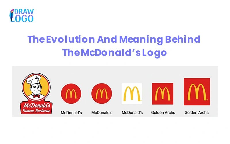
The Universal Language of Two Golden Arches

Picture this: you are out on a long drive, the highway stretching endlessly ahead. The sun dips below the horizon, your stomach growls, and then you see them. Two golden arches glowing in the distance. Without a single word, you know exactly what awaits: crispy fries, a juicy burger, and an ice-cold drink to recharge you for the journey.

That's the magic of McDonald's logo. It speaks a universal language, needing no words, no translation, or no explanation. Just a bold letter "M" shining in red and yellow colors is enough to trigger recognition from California to Sydney.

Quick overview

  • 1 Logo history & evolution timeline
  • 2 Design psychology & color meaning
  • 3 Competitive analysis & global adaptations
  • 4 Key takeaways for designers

McDonald's Logo History: The Foundation

When McDonald's Logo Was Founded

In 1940, Richard and Maurice opened a barbecue drive-in restaurant and soon discovered that hamburgers were their most profitable product. In 1948, they reorganized the business around hamburgers, fries, and milkshakes.

Story Behind McDonald's Name

McDonald's derives its name from the founders, Richard and Maurice McDonald. Using their surname gave the brand a simple and family-friendly identity that later became a worldwide phenomenon.

Ray Kroc: Driving Global Growth

Ray Kroc transformed this small family restaurant into the global fast food empire we know today, with thousands of outlets worldwide by the time of his involvement.

McDonald's Logo Evolution Timeline

1940-1948: Early Years

The original McDonald's started as a barbecue drive-in in San Bernardino, California. At this stage, there was no distinct logo—just a family-style roadside identity.

1948-1953: Speedee Era

The McDonald brothers introduced Speedee, a cartoon chef symbol of their speedy service system, focused on quick and efficient meals.

1953-1960: Name Change

The brothers made a significant decision by changing the name of their business to McDonald's, marking a move from a barbecue restaurant to a fast food model built around milkshakes, burgers, and fries.

1961-1975: Golden Arches Introduction

The golden arches were introduced into the design, adding a unique visual element to the McDonald's emblem. First shown with a diagonal slash, the arches later evolved into the iconic standalone "M," symbolizing consistency and familiarity worldwide.

1975-1993: Refinement

The arches were paired with McDonald's name in a clean and easy-to-read script, reinforcing brand recognition globally while maintaining warmth and familiarity.

1993-2003: Modernization

The golden arches were redesigned with shadows and 3D effects to match evolving design trends of the era.

2003-2006: Streamlining

The food brand made the logo further streamlined and visually sleek, focusing on minimalism. This emblem adapted to digital platforms, highlighting modernity and efficiency. The slogan "I'm lovin' it" was also added.

2018-Present: Minimalism

The logo embraced flat design, aligning with modern tastes and eco-conscious branding, while keeping the arches as the timeless symbol.

Interesting Fact: The golden arches are so iconic that if they are cropped, bent, or shown partially, people can still recognize the brand.

Design Psychology & Color Meaning

Golden Arches Symbolism

The golden arches represent the original architecture of early McDonald's restaurants and were later transformed into an "M" letter symbolizing the brand's core values: fun, fast, and reliable.

Color Psychology Impact

Red Color

Projects energy, excitement, and urgency, stimulating appetite and creating a sense of immediacy.

Yellow Color

Associated with positivity, warmth, and joy, creating a welcoming and happy atmosphere.

Impact on Brand Identity

Red and yellow colors evoke appetite, warmth, happiness, positivity, and urgency, reinforcing the brand's energetic and family-friendly environment while building global recognition and trust.

McDonald's vs Competitors: Logo Analysis

McDonald's
  • Golden arches are universally recognized
  • Red and yellow colors evoke appetite and happiness
  • Minimalist, modern, and adaptable across platforms
  • Represents affordability, speed, and consistency
Burger King
  • Uses buns and text in logo, word-heavy design
  • Red, yellow, blue/orange colors represent fun
  • Playful branding but less iconic recognition
  • Emphasizes flame-grilled taste
KFC
  • Colonel Sanders' face creates personal brand identity
  • Red and white symbolize warmth and tradition
  • Emphasizes family-style meals and secret recipe
  • Lacks universal recognition of McDonald's arches
Subway
  • Green and yellow arrows symbolize movement
  • Colors highlight energy, health, natural ingredients
  • Emphasizes customization and healthier choices
  • Fails to spark emotional connection like McDonald's

McDonald's Global Adaptations

Balancing Consistency with Local Appeal

McDonald's has mastered the balance between consistency and global adaptation:

Europe

Some outlets use a green background to emphasize sustainability and environmental consciousness.

Japan

The letter M sometimes appears with fun, limited edition mascots during special promotions.

Middle East

The arches are paired with Arabic script, blending global identity with local language requirements.

Key Takeaways for Graphic Designers

Color Psychology Matters

Strategic color choices can influence emotions, appetite, and brand perception on a subconscious level.

Simplicity is Powerful

The most recognizable logos are often the simplest—easy to reproduce and remember across all contexts.

Adaptability is Key

Successful logos must work across cultures, platforms, and applications while maintaining core recognition.

Consistency Builds Trust

Maintaining visual consistency across all touchpoints creates reliability and brand recognition.

Brand Storytelling Through Design

Every design element should contribute to the brand narrative and emotional connection.

Memorability Over Complexity

A logo that can be cropped, bent, or partially shown and still be recognized has achieved true iconic status.

Cultural Resonance

Understanding local culture while maintaining global appeal is crucial for international brands.

Conclusion: Golden Arches Built McDonald's Global Power

The McDonald's logo is more than the golden "M". It's a story of a brand that turned two architectural arches into a global symbol of fast food and familiarity. From the Speedee mascot to the letter M, McDonald's shows us how logos evolve and remain consistent.

With the use of color psychology, symbolic letters, and simplicity, McDonald's has not just created a logo, but a cultural phenomenon. The golden arches are not just a design element; they represent comfort, joy, and evoke recognition in every corner of the world.

Hire Designer