The Ultimate Guide to Famous Logos: Hidden Stories, Secret Meanings & Design Secrets Revealed
From the moment you wake up until you return to bed at night, you're surrounded by famous logos and iconic brand symbols. Your favorite restaurant has a brand, the shoes on your feet display recognizable logos, and yes, even that bed you sleep on carries a company logo. Even the "non-branded" stuff is kind of a brand when you think about it.
You know brands by their logos – visual calling cards that are instantly identifiable, at least if they're good ones. The really exceptional famous brand logos tell a story and make an impact that changes the way you think about the products they represent. They tell you what you're going to get and leave you feeling a certain something. Seeing them again brings that feeling rushing back.
"Quick Fact: The most recognizable logos in the world are recognized by over 90% of the global population – that's the power of effective logo design."
While you're surrounded by the art and design of branding every day, you may not know much about the people and stories behind the world's most famous logos. Some have humble beginnings that trace back centuries, while others hide clever secrets and hidden meanings in logos in plain sight.
What Makes Famous Logos So Powerful? The Psychology Behind Iconic Brand Design
The earliest famous company logos can be traced back to ancient family crests in the Middle Ages. People with pubs and shops started using various symbols to represent what they did and to distinguish themselves from others in their line of business.
But why is it so important for a brand to have an impactful logo design? Because first impressions count, even for businesses. A well-crafted company logo can:
- 🎯 Send the right message to potential customers instantly
- 🧠 Create emotional connections that drive purchasing decisions
- ⚡ Build brand recognition that lasts for generations
- 💡 Communicate brand values without saying a word
"Quick Fact: Logo Design Tip: The most successful famous logos combine simplicity with meaning – they're easy to recognize but rich in symbolism."
With so many iconic brand logos competing for attention nowadays, especially since the beginning of e-commerce, it's easy to overlook the hidden meanings and symbols in everyday products. Let's dive into the fascinating stories behind some of the world's most recognizable logos and discover what makes them unforgettable.
The Most Famous Logos in History: Origin Stories That Changed Everything
The Golden Arches: From Barbecue Stand to Global Icon
The McDonald Brothers' Revolutionary Vision
One of the most recognizable logos in the world didn't start in a corporate boardroom. The Golden Arches story can be traced back to when McDonald's was just a small barbecue stand in California, owned by brothers Richard and Maurice McDonald in the 1940s.
When the brothers realized that most of their sales were coming from hamburgers, they simplified their menu and focused on pioneering the fast-food system. This new streamlined process proved so successful that by 1952, the brothers decided to open a second location.
The Birth of an Architectural Icon
The brothers wanted their new store to be eye-catching, but they also wanted to create an environment that encouraged customers to come in, finish their meal promptly, and then go about their day.
Working with architect Stanley Clark Mestan, Richard McDonald quickly sketched half-circle arches to convey a sense of movement and speed. Mestan took it from there, and they liked the design so much that the arch became a requirement for every franchisee McDonald's opened in the 1950s.
Evolution Into the Modern Logo
By the 1960s, McDonald's was looking to change its branding. Attempts were made to create a fresh new logo, but it was Jim Schindler, the company's head of engineering and design, who repurposed the Golden Arches into a stylized "M."
Even as the company's branding has changed with the times, the Golden Arches have remained crucial to the McDonald's brand. With 86% overall awareness in the top 10 countries McDonald's surveyed in 2004, their reach is staggering.
Pro Tip: According to Steven Bun Worthy, in the US, the farthest you can possibly be from a McDonald's location is 107 miles. Whether it's highway rest stops or busy city intersections, you can't get very far without seeing those Golden Arches.
The $35 Logo Worth Billions: Nike's Swoosh Story
A Student's Chance Encounter
Similar to the Golden Arches, the Nike Swoosh is clean, clear, and immediately evokes images of quickness and athleticism. The Nike brand is worth over $26 billion today, but it may surprise you to find out that the logo only cost $35 in 1971.
Carolyn Davidson, a graphic design student at Portland State University, was mentioning to a friend outside of class one day that she couldn't afford to take an oil painting class. Associate professor Phil Knight happened to be walking by and overheard the conversation.
The Design Process That Changed Everything
Knight asked Davidson if she'd be interested in doing some freelance work for Blue Ribbon Sports, a company he co-founded with track coach Bill Bowerman. Davidson agreed at the rate of $2 per hour.
Part of the assignment was to come up with a logo for a shoe brand they were working on. Knight wanted it to convey movement and motion, and Davidson's job was to make Knight happy while moving away from his obsession with the Adidas logo.
Hundreds of Ideas, One Perfect Solution
Davidson tried hundreds of ideas. While she admits that she doesn't quite know how long it took, she only charged for 17.5 hours of work. She sketched logos on tissue paper and put them over actual shoes to see how they worked on the product itself.
When Davidson presented her team with various designs, nothing was particularly well received. But Knight kept coming back to the first design of the lot – the infamous Swoosh.
Success Story: It took over a decade for Davidson to get the recognition she deserved, but in 1983, Nike threw a party in her honor. They presented her with a diamond-encrusted gold ring with the Swoosh on it, along with 500 shares of Nike stock – now worth well over $600,000.
"Quick Fact:💰 Brand Value Alert: Nike is now worth over $26 billion, making the Swoosh one of the most valuable logos in the world. That $35 investment became worth billions!"
🎨 Design Your Own: Want to create a logo with similar movement and energy? Consider these Nike-inspired design principles:
- Use curved lines to suggest motion
- Keep it simple enough to work at any size
- Think about what emotion you want to convey
- Test how it looks on your actual product
Apple's Mysterious Origins: Myth, Legend, and Reality
The Urban Legends
Some brands develop myths and legends around their origin stories. Apple, arguably the most famous tech company in the world, known for its focus on simplicity and function, doesn't have a clear and obvious history for its iconic logo.
One urban legend insists that the Apple itself is intended to evoke the forbidden fruit from the tree of knowledge in the book of Genesis. Another suggests it's a reference to Alan Turing, the grandfather of computing whose research broke German codes during World War II. Prosecuted for his homosexuality, Turing committed suicide by eating an apple poisoned with cyanide.
The Designer's Perspective
Rob Janoff, the creator of the logo, admits that he doesn't know the exact reason why Apple is named Apple. He suggested it's possibly because Steve Jobs once lived on a farm in Northern California with an apple orchard.
The Newton Connection
A look back at the very first Apple logo provides more clarity. The original logo was designed by Apple's co-founder Ronald Wayne and featured a hand-drawn illustration of Sir Isaac Newton sitting under an apple tree with a conspicuous apple hanging right above him.
According to legend, Newton devised the theory of gravity after being struck by a falling apple. The idea was solid, even if the logo itself was too complex for practical use.
Simplification and Color
Steve Jobs wasn't a huge fan of the complex Newton design, so they hired Janoff in 1977 to create a simpler version. The initial version featured rainbow stripes to make the products look more user-friendly, appealing to schoolchildren, and to emphasize Apple's ability to show images in color.
Design Insight: The logo has undergone only the slightest changes over the years and is easily one of the most identifiable in history. But why is there a bite taken out of it? In a 2016 interview, Janoff offered a simple explanation: "I was going for the silhouette of an Apple, but to make it look more like an apple and not some other round fruit, I did what one does with an apple – I took a bite out of it."
The FedEx Arrow: A Masterclass in Subtle Design
The Journey to Simplicity
The FedEx logo you know and love had a long journey to fruition. The first logo, created in the early 1970s by Richard Runyan, showcased thick letters spelling out the company's full name, "Federal Express." That logo was certainly bold, but it looked too much like something out of Tron to age well.
Lyndon Leader's Vision
In 1994, designer Lyndon Leader from the brand consulting agency Landor Associates began work on a new simplified design focused on clarity. In an interview published in The Laws of Subtraction, Leader explained his philosophy:
"Early sketches always have too much going on, too much to think about, and too much extraneous stuff. I slowly begin to remove things, but it's always the final one that's far more simple and far more clear than the more elaborate ones I labored over at the beginning."
The Hidden Arrow Discovery
As Leader experimented with fonts, he noticed the outline of an arrow appearing between the "E" and the "X." Using two different fonts as a base, he tweaked the kerning until the arrow appeared to fit naturally.
Design Philosophy: Not everyone understood the value of the understated design. Leader recalls that FedEx's PR firm immediately wanted to supersize the arrow – make it obvious, fill it in with another color. "They didn't get it. It wasn't about the arrow. An arrow wasn't even interesting to look at. It's only because of the subtlety that it's intriguing."
Leader says the most rewarding aspect of the design is when children first see the arrow by themselves and point it out to their parents. That kind of recognition is exactly what branding and logo design are all about.
The Ultimate Guide to Hidden Logo Meanings: Secrets Hiding in Plain Sight
🔍 Spot the Hidden Elements Challenge
Can you find these hidden symbols before reading the explanations?
FedEx: The Speed Arrow ⚡
Look closely between the letters "E" and "X" in the FedEx logo – you'll spot a white arrow pointing right. This hidden arrow represents speed, accuracy, and forward movement, perfectly capturing the company's delivery promise.
🎨 Design Technique: This uses negative space – the empty area between letters becomes part of the design itself.
Amazon: A-Z Smile Connection 😊
The Amazon logo arrow goes from "A" to "Z," showing they sell everything. But it's also shaped like a smile, adding friendliness to the brand. That little curve transforms a simple arrow into an emotional connection.
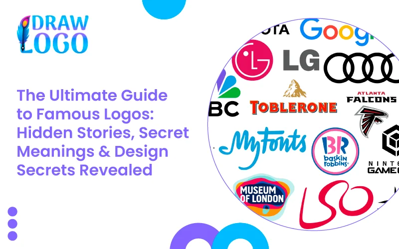
Baskin-Robbins: 31 Flavors Forever 🍦
Between the letters "B" and "R" in the Baskin-Robbins logo, you'll find the number 31 in pink. This represents their original 31 flavors and the idea that you could try a different flavor every day of the month.
💡 Logo Design Tip: The pink "31" only appears when you isolate that part of the logo – it's a perfect example of logos with hidden meanings.
| Logo | Hidden Element | What It Means | Design Technique |
|---|---|---|---|
| FedEx | Arrow between E-X | Speed & precision | Negative space |
| Amazon | A-Z smile arrow | Everything + happiness | Dual meaning |
| Toblerone | Bear in mountain | Swiss heritage | Negative space |
| Beats | Person's head + headphones | Product visualization | Visual metaphor |
| Formula One | Number "1" | Racing supremacy | Negative space |


.webp)