The History of the McDonald Logo
McDonald's Logo History - Evolution from 1940 to Present
McDonald's Logo History - Evolution from 1940 to Present
From the modern drive-in in San Bernardino, California, to a global food empire, McDonald's has not only transformed the way the world eats but also how a brand is recognized at first glance. Few logos become easily identifiable as the Golden Arches, a symbol that evokes familiarity, affordability, and efficiency. However, the McDonald's logo history from 1940 to the present is worth exploring, revealing how each redesign reflected the brand's growth, cultural shifts, and its ability to remain timeless while adapting to changing trends.
Evolution of McDonald's Logo
McDonald's is not just a fast food restaurant but a true legendary brand that embodies success through simplicity and consistency. Founded in 1940, McDonald's has expanded across continents with thousands of locations worldwide, becoming one of the most recognizable names in the industry. Its journey was far from overnight success.
To understand its growth, let's take a closer look at McDonald's logo changes and how each redesign reflects the brand's evolution over time.
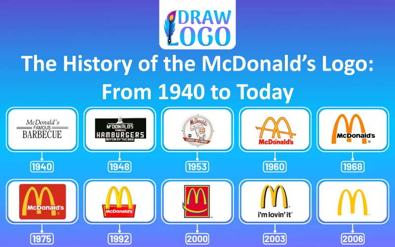
1940-1948: The First McDonald's Logo

In 1940, two brothers, Richard and Maurice McDonald, launched a barbecue drive-in restaurant in San Bernardino, California. At first, the menu was centered around barbecue items, including hot dogs rather than fries and hamburgers McDonald's is famous for today. During this stage, the logo was not a major priority; the brothers were more focused on creating a relaxed and family-friendly roadside stop.
1948-1953: Speede Character

Richard and Maurice introduced the Speede character, a chef with a round and conical hat, into their logo design. This transition marked a significant shift from their original concept of Barbecue to a menu focused on hamburgers, fries, and shakes. The Speede logo symbolized their new speed service system, which highlights fast and efficient service. This change laid the foundation of modern fast food.
1953-1960: Name Change and New Logo

In 1953, the McDonald brothers refreshed the logo design by introducing the McDonald's wordmark to it. Designed in a bold red and white color scheme, this clean and striking logo set the foundation for the brand's future as an international fast-food giant.
1961-1975: The Golden Arches Begin

The logo design faced a significant transformation from 1961 to 1975.
- The first Golden Arches logo included a diagonal line across the arches to represent the slanted roof of McDonald's early restaurant design.
- The golden arches were later stylized into an M shape along the McDonald's name, emphasizing innovation and simplicity. It symbolized quick service, a welcoming atmosphere, and a familiar dining experience around the world. This marked a profound transformation towards worldwide recognition.
1975-1993: Sleek and Refined Look

During this era, the M letter in the logo was refined and paired with McDonald's name in an easy-to-read typeface, creating a clean and professional appearance. This design strengthened brand recognition while preserving the familiarity and warmth the brand was known for.
1993-2003: Modernization

To adapt to the digital era and changing marketing trends, McDonald's design evolved to be more modern by incorporating shadows or 3D effects. It gracefully highlighted the brand's focus on staying up-to-date and competitive in the ever-evolving fast food industry.
2003-2018: Streamlined Design

From 2003 to 2018, McDonald's introduced a streamlined logo featuring bold and simplified gold arches that were easier to adapt across digital and print media. This era marked a significant shift in McDonald's brand identity, highlighted by the introduction of the "I'm Lovin' it" slogan, which reinforced its youthful, modern, and globally appealing image.
2018-Present: Return to Red Background
In the current phase, starting in 2018, McDonald's returned to its classic red background paired with bold golden arches. This design balanced nostalgia with modernity, reflecting McDonald's global growth while preserving minimalism and approachability.
The McDonald's logo is more than a visual image; it's an iconic design that has evolved while continuing to convey warmth and comfort.
Conclusion: Legacy of McDonald's Logo Timeline
The history of McDonald's logo is a testament to the brand's consistency, adaptability, and ability to stay culturally relevant. From its drive-in restaurant beginnings to global sensation, the logo's evolution mirrors McDonald's growth and timeless charm. Today, the golden arches are not just an invitation to eat; they represent a symbol powerful enough to unite billions under one iconic emblem.


.webp)